 Project hero image — new logo, large and centered, on deep navy
GrupRV
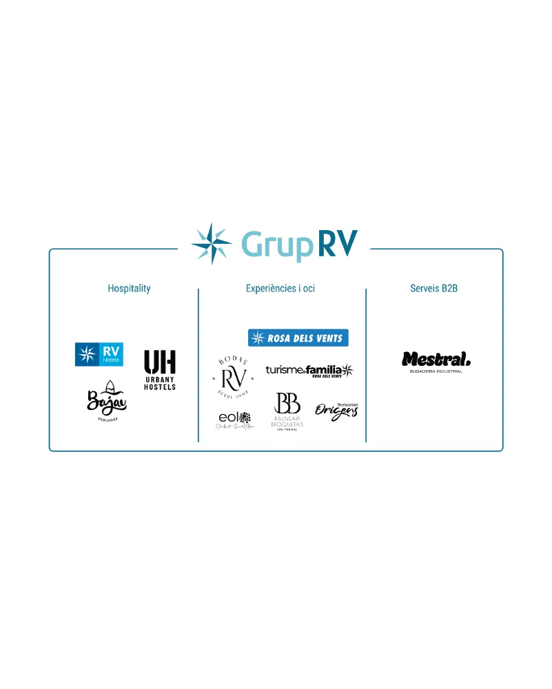
Grup RV had grown over 50 years from a single company, Rosa dels Vents, into a multi-sector holding — hotels, weddings, experiences, B2B services — but its identity hadn't kept pace. Up to seven versions of the same logo were in circulation, each still carrying a "Grup Rosa dels Vents" descriptor that added noise and took away authority.
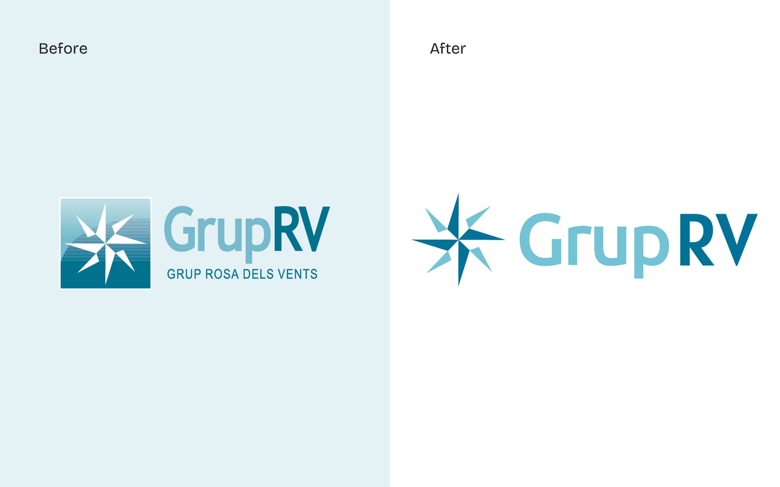 The problem — 7 conflicting logo versions in circulation ("before")
I audited every version in use, then designed a single mark that doesn't need a subtitle to explain itself; freeing every brand underneath it to lead its own market, with GrupRV as the seal of trust behind them.
A logo shouldn't have to explain itself.
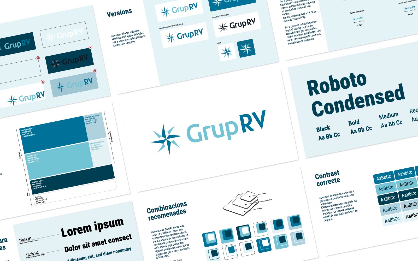 The solution — new logo, clean, on white, full bleed
 Brand architecture — GrupRV at top, RVHotels / Bodas RV / Rosa dels Vents / Mestral / Urbany below
 Brand manual spread — logo system and color palette
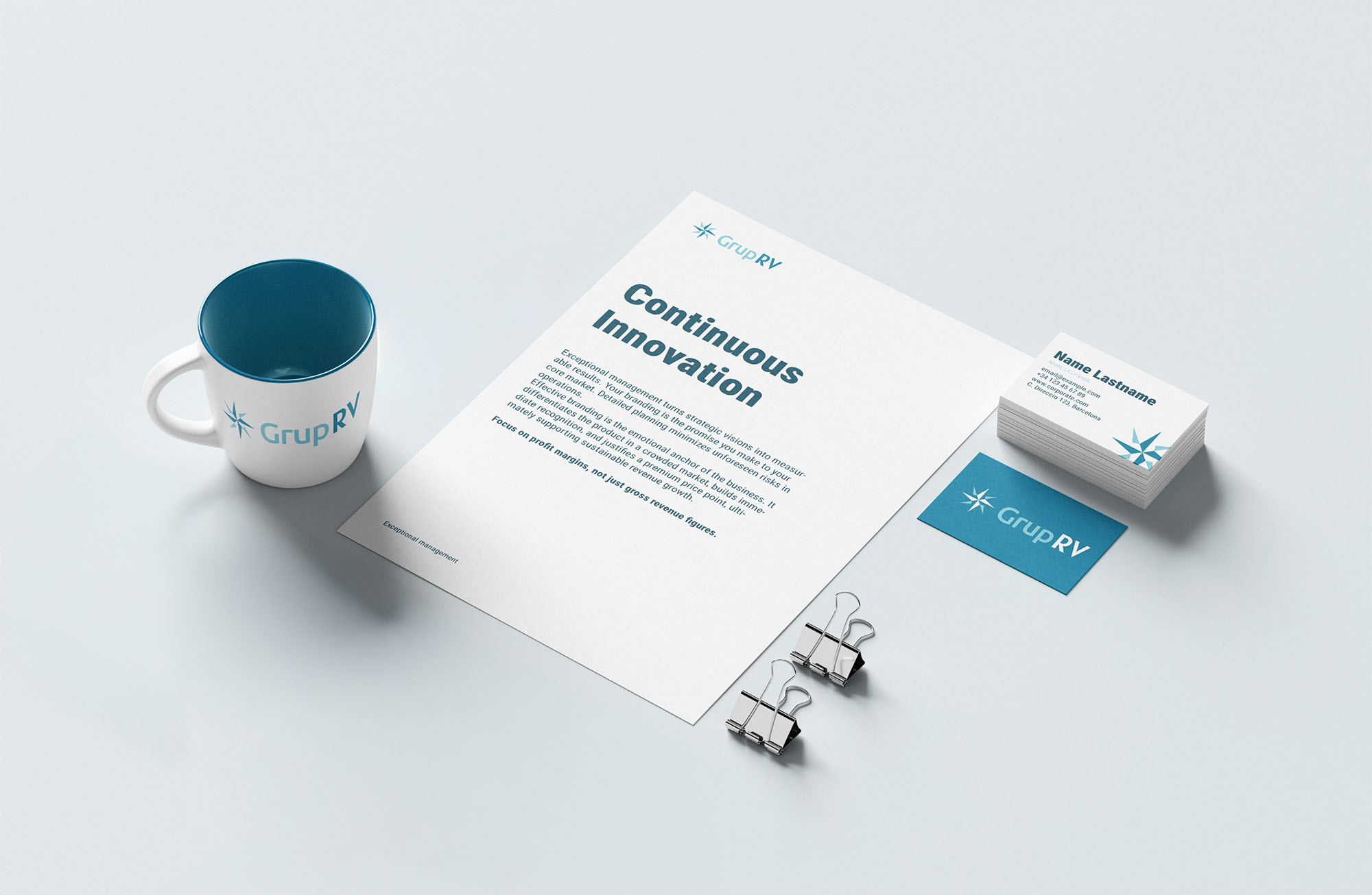 Corporate mockup — logo on a business card / letterhead / presentation cover