 Project hero image — mod wordmark, cream on dark forest green
Project hero image — mod wordmark, cream on dark forest green
Project hero image — mod wordmark, cream on dark forest green
mod
Urbany Hostels wanted to incorporate a specialty coffee corner in reception. The problem? The only brief was "we need a name and a logo", so here is where my research of the specialty coffee market began. I needed to define a strategy based on the only thing I knew about the brand: it’d be to-go only and it’d be located next to the reception desk. It was during research that I found out the real challenge, Barcelona is one of the cities with the highest concentration of specialty coffee shops. From there, I knew this brand had to be different, it needed to differentiate itself from the idea that good coffee is a luxury, not accessible.
mod was built with the vision of a world where specialty coffee is everyone’s starting point.
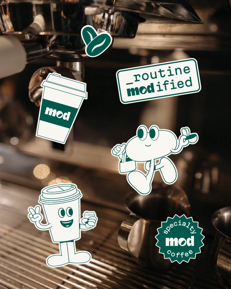
 Logo variations — blob/pill lockups showing system flexibility
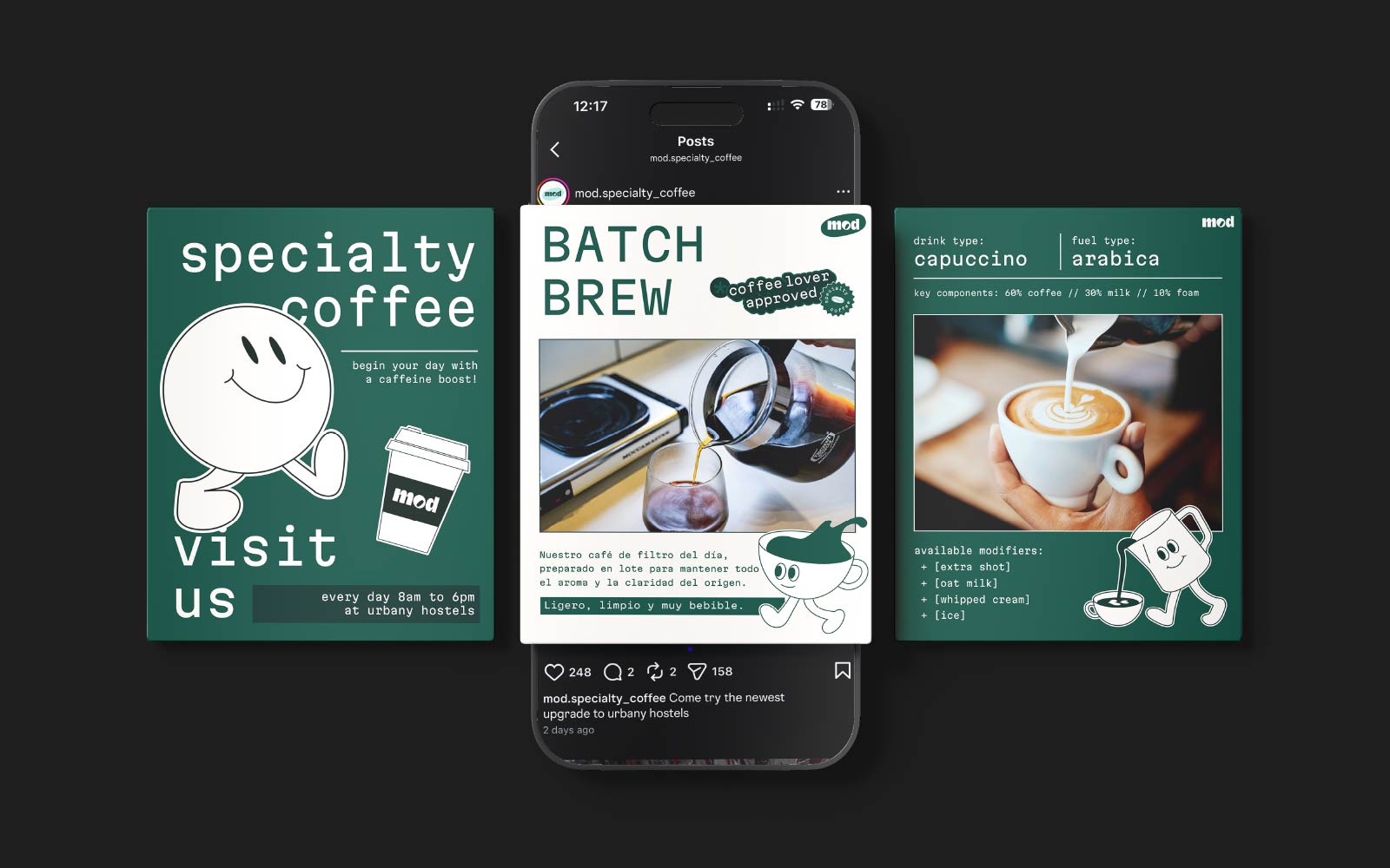
I worked through dozens of naming directions before landing on mod. Mod is a nod to the gaming idea of a small addition that upgrades the whole experience, much like adding a specialty coffee corner to a youth hostel or a cup of good coffee to your routine.
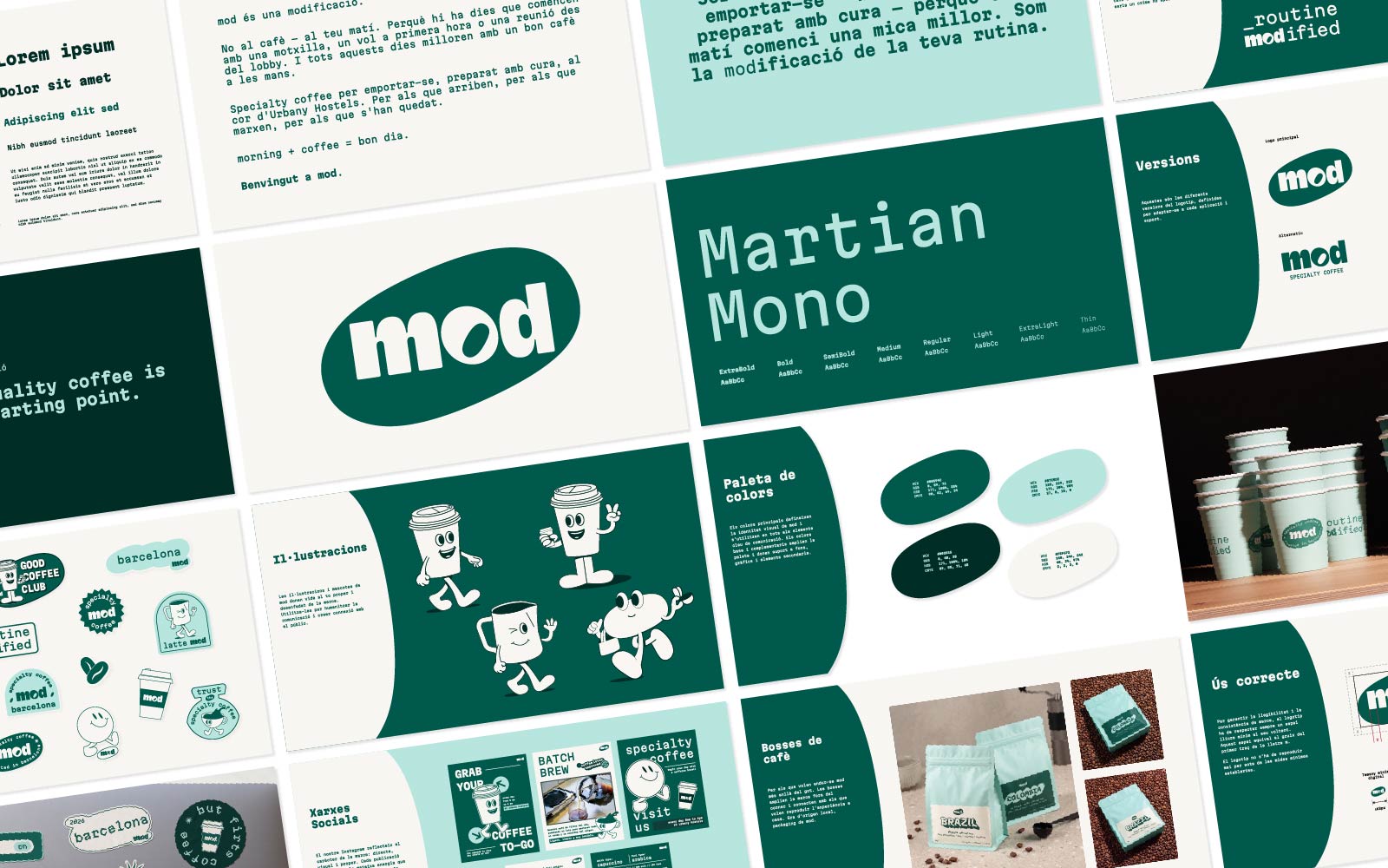
I paired it with Martian Mono, a monospace coding typeface, and built the identity around greens and a retro-coding personality that makes the brand distinct.
Something small you add that makes everything better.
 Color palette — Forest Green, Green, Mint, Cream
 Typography — the Martian Mono system
 The iteration story — v1 blue identity next to v2 green identity
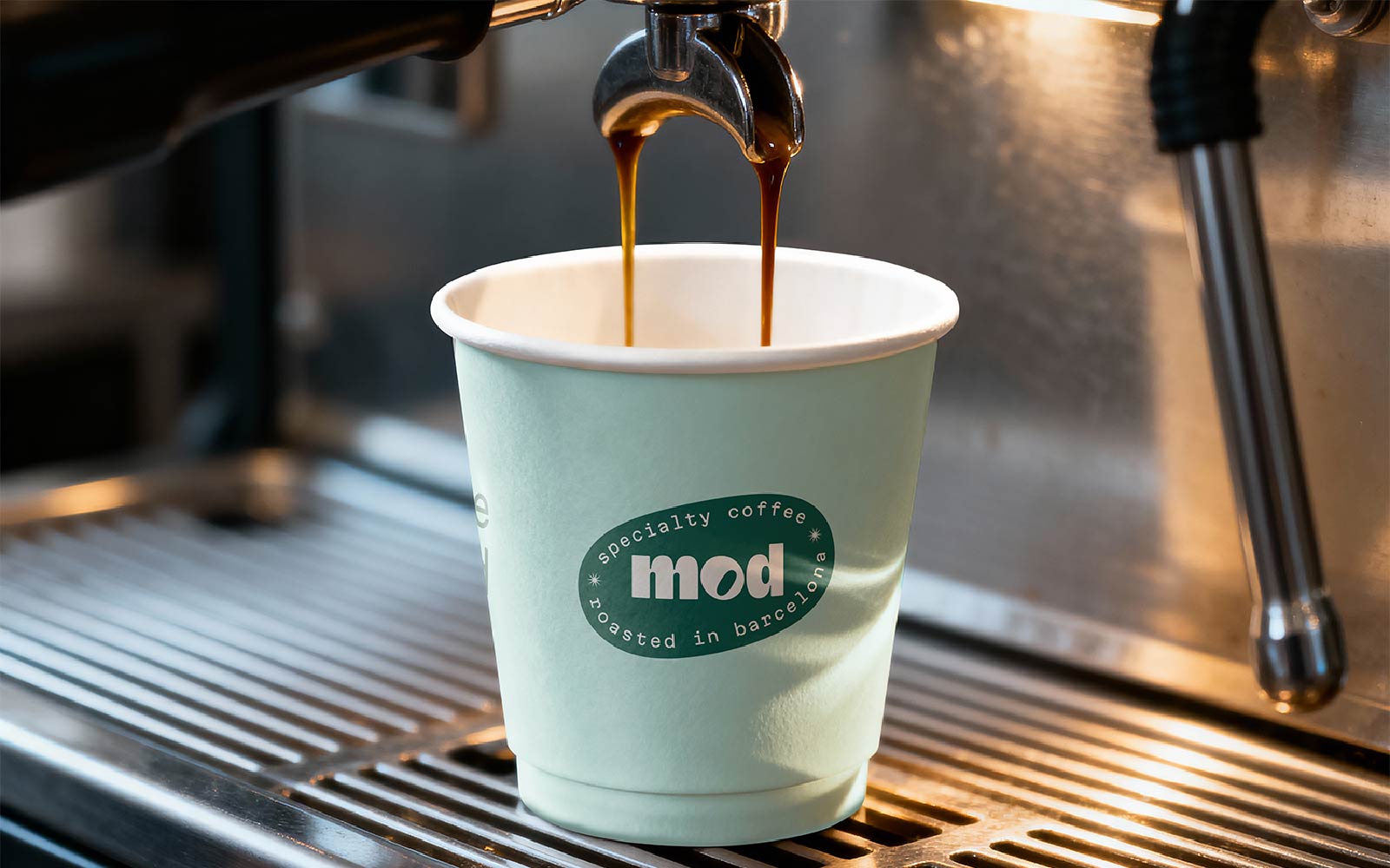
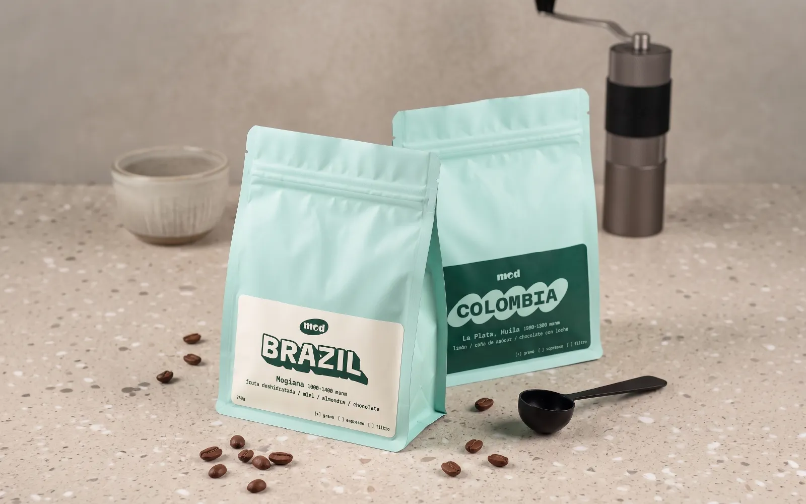 ⭐ The cups in use — the brand, live, in the real world